

LOGOS & Style guides


Style Guides
Below are some Style Guides that InHouse Design Studio has created for our lovely clients. You can see that some logo applications are more complex and require multiple versions of the same design, depending on the specific situation and how the logo is used while others are quite straightforward. Scroll down click on the images to view the documents.
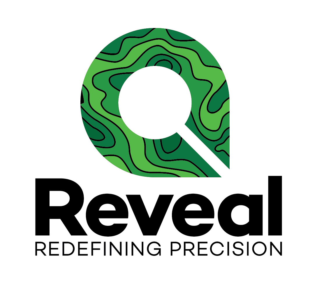
REVEAL: Redefining Precision
InHouse Design Studio worked closely with the Reveal/Akros team to create this logo. After many brainstorm sessions, I presented a detailed concept paper, showing 5 well developed ideas and how I thought they would work for the project. The final result is a mash-up of three of these. It is a testament to the team’s commitment to “getting it right” that we ended up with a final product we’re all proud to see make its way out into the big bad world of spatial entomology and health care delivery.
(Click on the logo to open Reveal’s Style Guide.)

Lusaka International Community School
InHouse Design Studio worked with LICS on two very different tracks simultaneously: give the school a totally new look or keep the same logo - with significant work to standardise the look and feel of everything the school released into the world from the uniforms to the school letterhead, website, annual reports, etc. In the end, they opted for a logo re-design which InHouse supported. The school knew that no matter what they decided, they would need to phase in the new logo, replacing branded items from sun hats to letterhead only as the old stock was depleted and they needed to reorder. We decided that cleaning up and stylizing the existing logo was the most economic option. We also felt that because the brand was well established, starting with a whole new logo (and even a new school name) was not something that they felt the community was ready for.
Notice that this document pays more attention to guiding consistent and appropriate use of the logo than the logo design itself.
(Click on the logo to open the LICS Style Guide.)
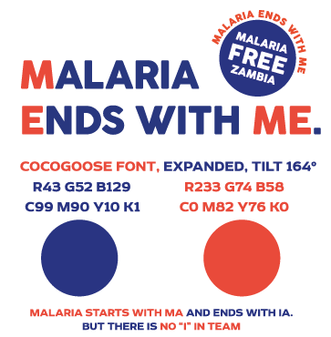
MINI STYLE GUIDE: MALARIA ENDS WITH ME
Not every project needs a complex style guide. For this project, the National Malaria Control Centre needed minimal guidance on color, font and presentation.
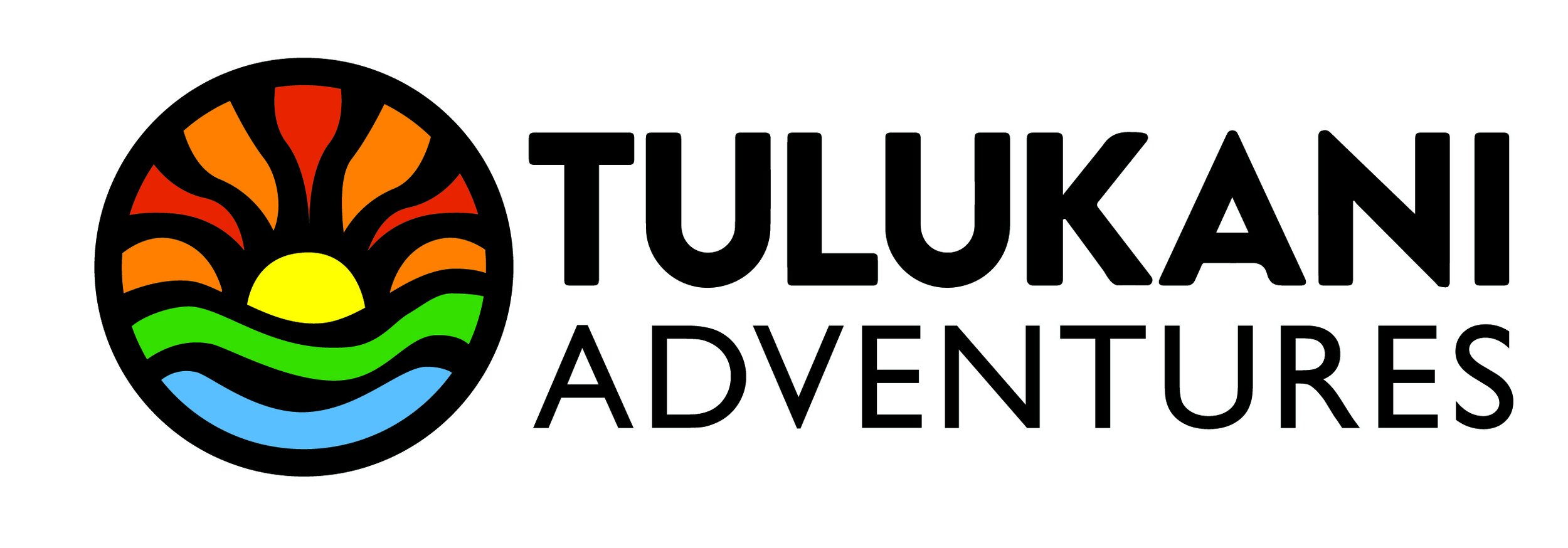
Tulukani Adventures
This project started with what I felt was an amazing and perfect name for this new brand: Tulukani Adventures. “Our name Tulukani Adventures reflects our ethos and our origin in Zambia. Tulukani is derived from the ChiNyanja/ChiChewa verb tuluka which means to go out or emerge. Providing transformative experiences is at the heart of what motivates us.”
We arrived at the final logo through quite a length process but the goal was really to get the logo…perfect. This is no small feat but it was an absolute pleasure. Sometimes InHouse services stop at the logo design, but as you can see in the style guide, we also worked extensively on Tulukani’s branding: brochures, stickers, uniforms, name plates, apparel and so on.
(Click on the logo to open the Tulukani Style Guide.)

COFFEE CULTURE & CO
The original concept for Coffee Culture evolved from being stark black, white and yellow to this soothing palette of sea glass greens with red coffee berry accents.
From the beginning of the project the look and feel of the cafe and cart/kiosk’s physical space was integrated into the design process. CC&Co was taking over a space (which InHouse had also branded) - the new shop needed to be transformed from fun and funky to sleek and modern. The colour scheme chosen for the logo (and the cafe) fit this need to a T.
(Click on the logo to open the Coffee Culture Style Guide.)